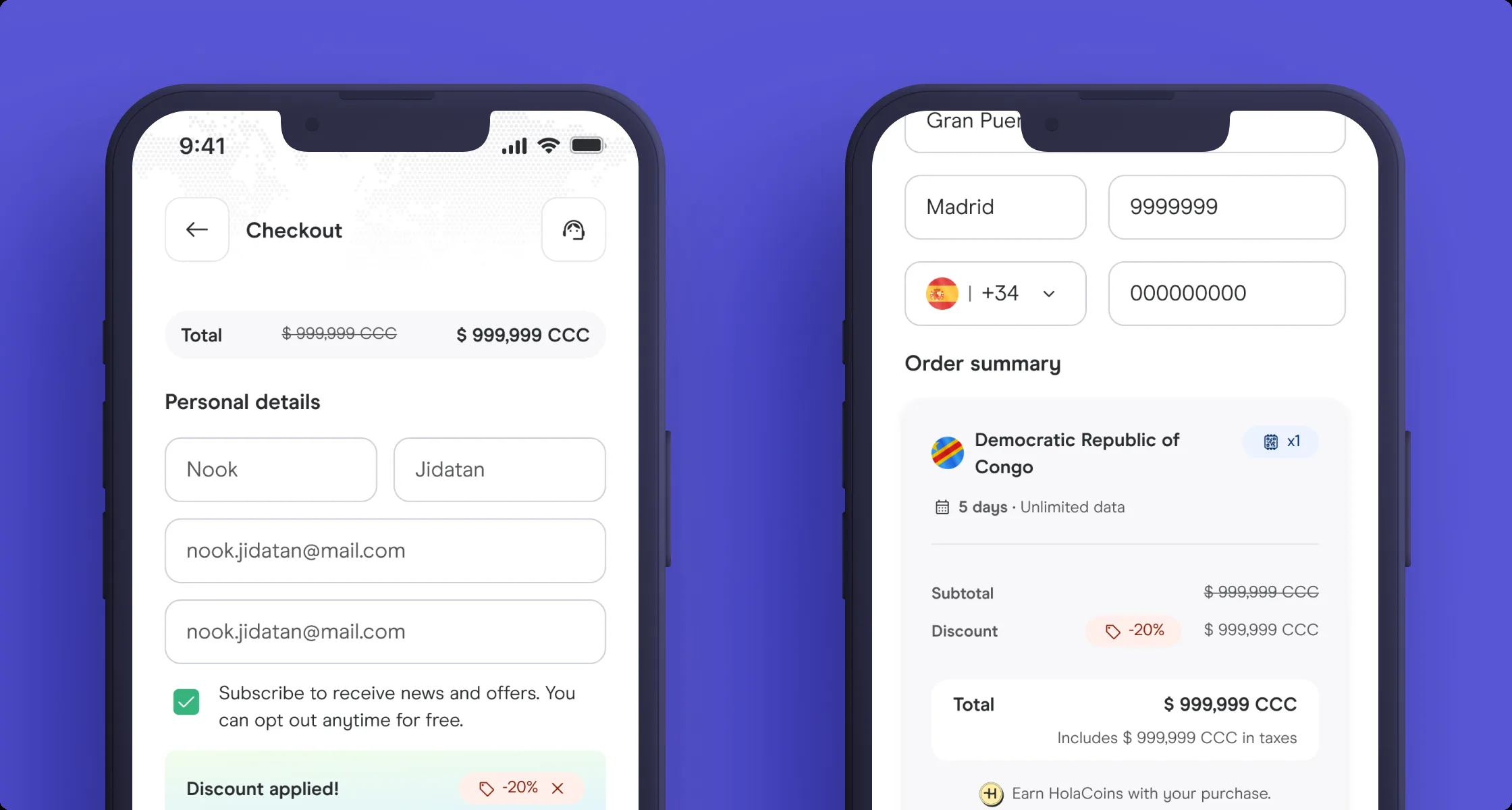
01 — The context
Three checkouts, three codebases, zero shared logic.
Three checkout experiences had been built over years by separate squads, each with its own fields, validation rules, and fraud logic. Desktop, responsive, and app behaved as strangers to a single buyer.
Before proposing anything, I opened each checkout on every platform and walked through the flow side by side, documenting every field, every validation rule, every error message, and every payment method. I recorded the three experiences and built a comparison spreadsheet mapping field by field where they agreed and where they diverged. That audit surfaced 23 specific divergence points. Without that spreadsheet, the conversation with engineering and product would have stayed at "they're different" instead of "here are the exact 23 things that are different and here's which ones matter."
02 — The problem
New anti-fraud requirements were landing on three codebases at once.
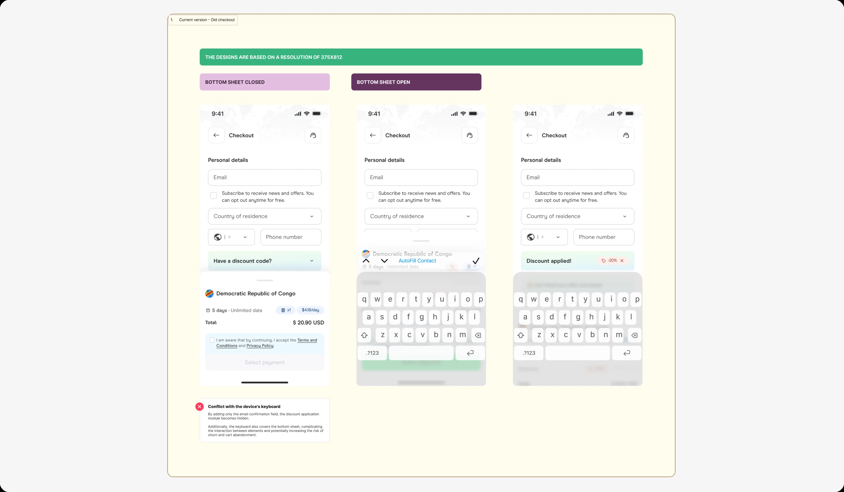
Every fix doubled in cost, every change in copy risked contradicting the next surface. The order summary on iOS was obscured by the keyboard. There was no capacity for new compliance fields without a full redesign on each surface.
The trigger was a new anti-fraud regulation requiring billing address validation and 3DS authentication. On desktop, billing address was already required. On responsive, it was optional. On the app, the field didn't exist. Implementing the same compliance requirement meant three separate engineering efforts, three separate QA cycles, and three separate chances to introduce inconsistency. I mapped the cost: every compliance change shipped three times, tested three times, and contradicted itself in error copy across surfaces. That cost analysis is what got product leadership to approve the unification project instead of patching each surface independently.
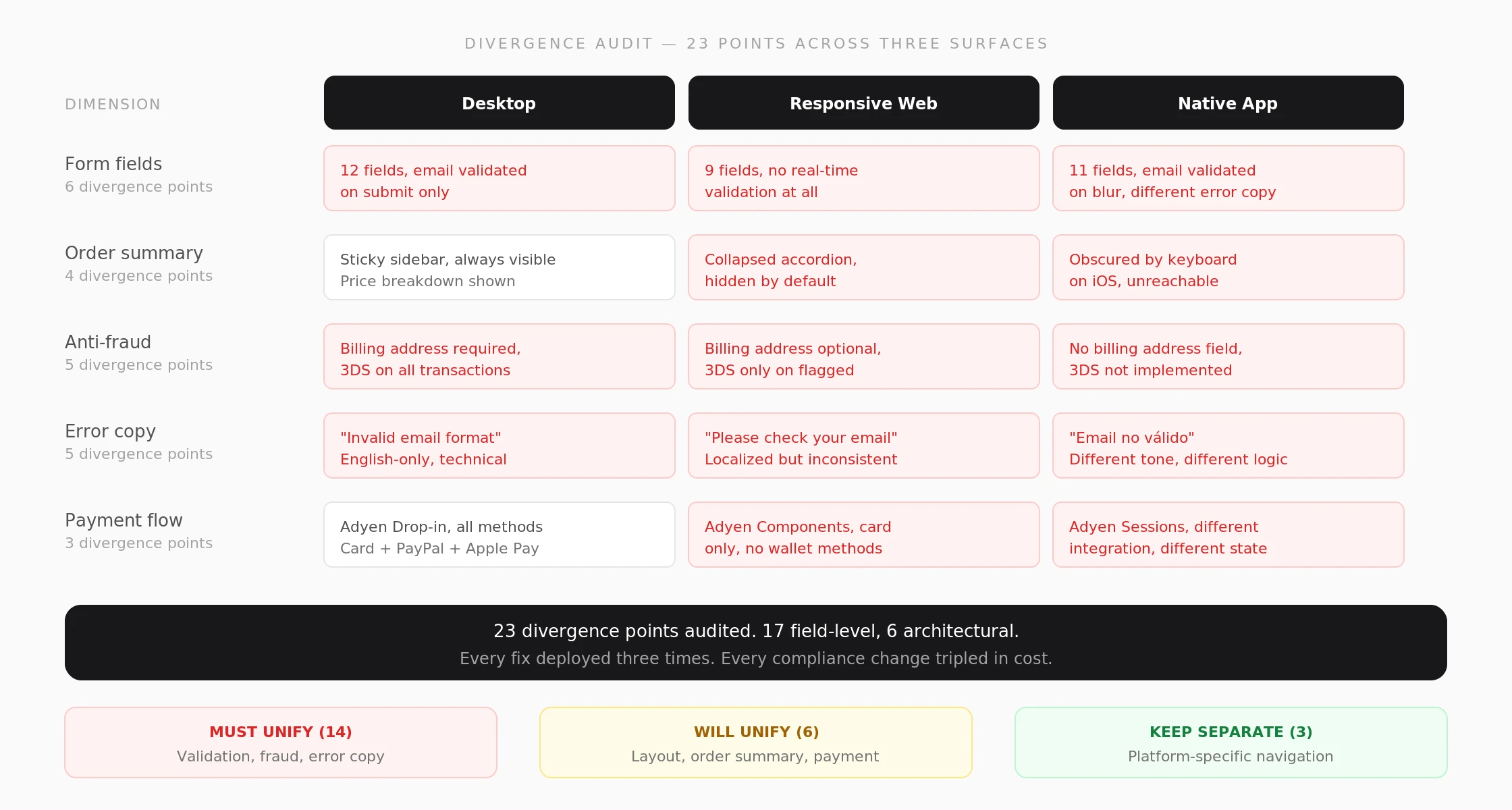
Divergence audit. 23 points mapped across desktop, responsive, and app. 17 resolved into shared behavior, 6 kept separate on purpose and documented as intentional.
03 — What I did
Auditing divergence, designing convergence
1. Audited the 23 divergence points across the three flows. 17 resolved through unification, 6 kept separate by design.
2. Designed a single field architecture with shared validation states and anti-fraud fields.
3. Introduced AI-assisted copy and flow validation as a weekly ritual.
4. Led the phased rollout: desktop first, then responsive web, then native app.
5. Built the unified component library in Figma with auto-layout variants for every field state (empty, focused, valid, error, disabled) and documented edge cases: keyboard covering the order summary on iOS, double-email validation, and billing address requirements per market.
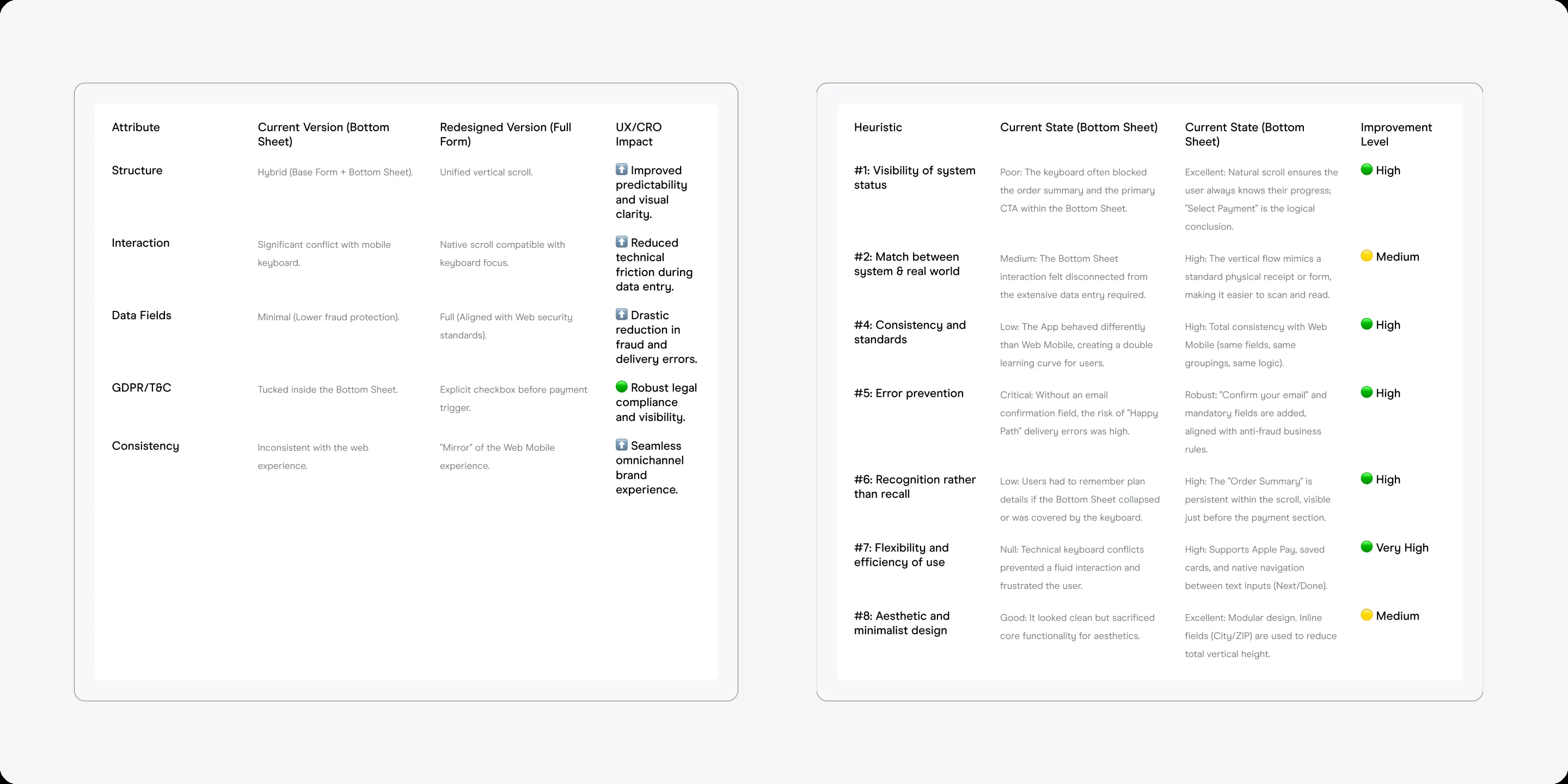
Field-level audit. Spreadsheet mapping every divergence point across the three surfaces, sorted by impact on fraud compliance.
04 — Process artifacts
From audit spreadsheet to shared architecture
Of the 23 points, 17 were resolved into a single shared behavior. The remaining 6 stayed different on purpose: market-specific validation timing, local payment methods, and legal copy that cannot be shared across regions. Each one is documented with its reason.
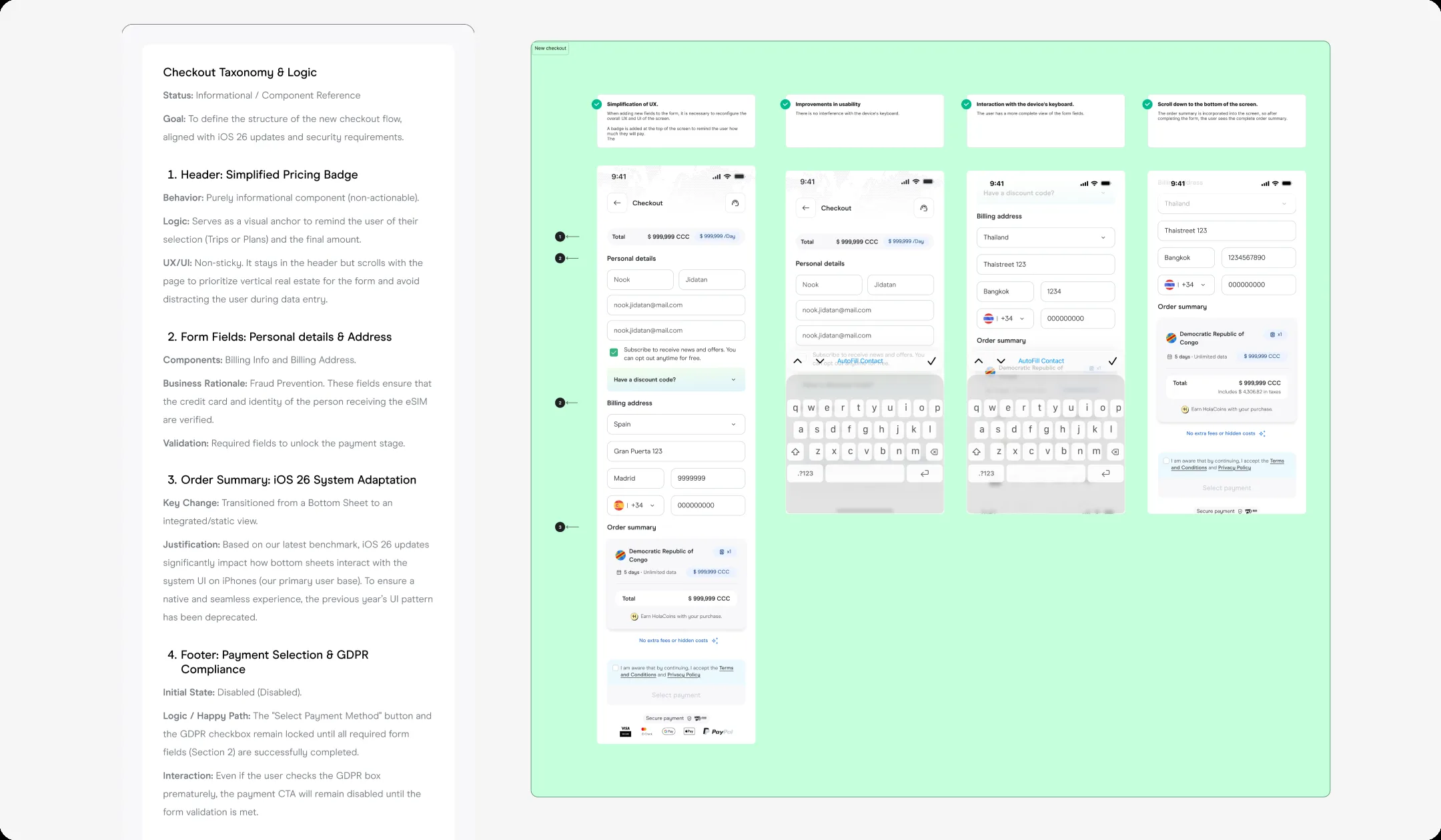
Unified field architecture. Shared validation states, consistent error copy, market-specific fields that adapt but never contradict.
05 — The solution
Three surfaces become one coherent system
One component library, three layout contexts. Shared validation on blur across all surfaces, same error copy, market-specific fields that adapt but never contradict. The iOS order summary stayed visible above the keyboard. Anti-fraud fields shipped once and propagated to all platforms.
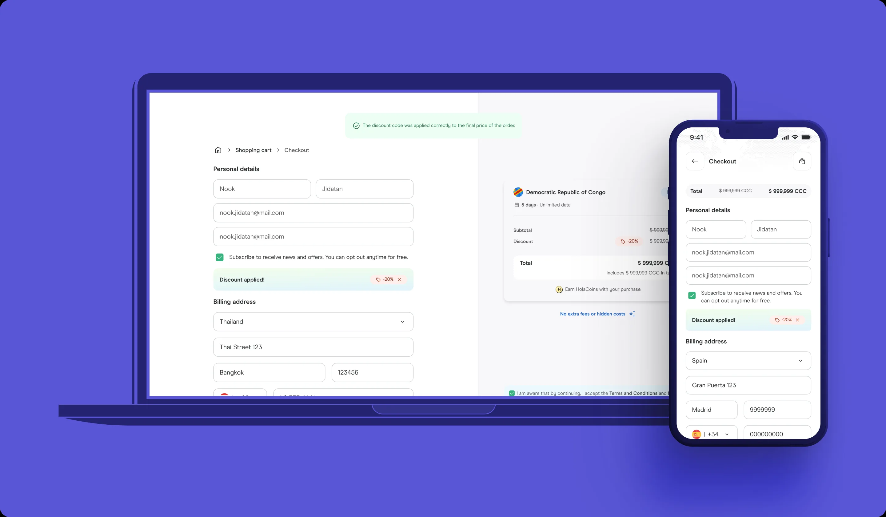
Three surfaces, one system. Desktop, responsive, and app side by side. Same validation, same error copy, same fraud fields.
06 — The result
One system, zero contradictions
Checkout conversion rose 17% on the e-commerce surface in the 30 days after consolidation. Three surfaces collapsed into one design system, and fraud compliance rolled out once instead of three times.
New anti-fraud fields now ship once and scale across all platforms. The weekly AI validation ritual caught 12 inconsistencies in the first 8 weeks.
The Figma file became the single source of truth for three engineering squads. Structured components with auto-layout meant engineers could inspect field behavior directly from the file. No separate spec document, no handoff meetings for edge cases.
07 — What I learned
Unification is a negotiation over ownership
The designs landed only because we named the exact 23 points up front. Without that audit, stakeholders would have debated "should iOS look native" forever. Naming the specific tradeoffs unblocks decisions.
The other lesson: unification isn't about making everything look the same. It's about making everything behave the same. A shared validation rule matters more than a shared button radius. I pitched this framing to product and engineering leadership early, and it set the scope for the entire project.
08 — Decisions not made
What I chose not to change
1. I didn't redesign the payment flow. Payment integration was a separate system with its own constraints.
2. I didn't enforce a single validation timing. Some markets required on-submit validation for legal reasons.
3. I didn't deprecate the app checkout immediately. The native app team needed a migration path, not a deadline.