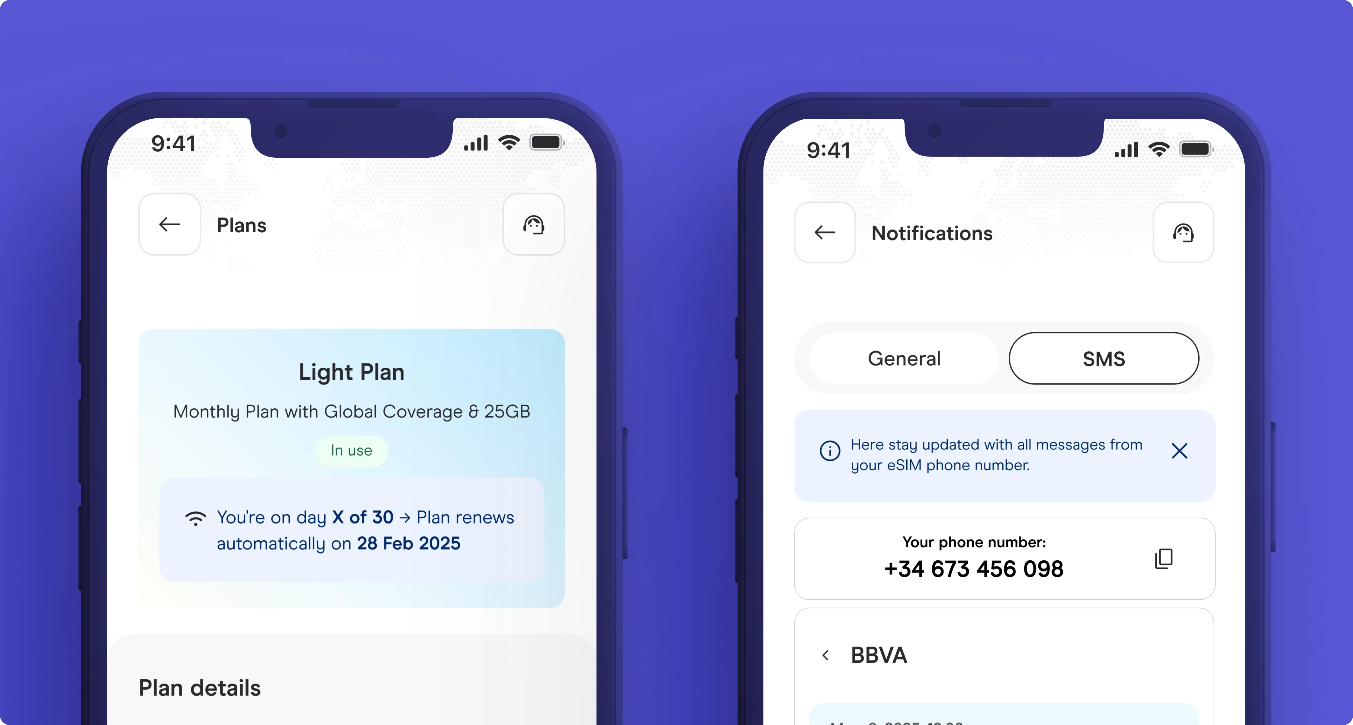
01 - The context
The app sold plans but abandoned users after purchase.
The app could sell a plan in two taps but offered almost nothing afterwards. Managing a subscription, cancelling, reactivating, or activating a phone number all lived in different surfaces scattered across the app. Post-purchase was a dead zone.
I started by pulling three months of support ticket data and categorizing them by lifecycle stage. Then I ran session recordings through Amplitude to trace where users dropped off after purchase. The pattern was clear: the app had been designed for acquisition. Every screen after the buy button was an afterthought built by a different squad at a different time.
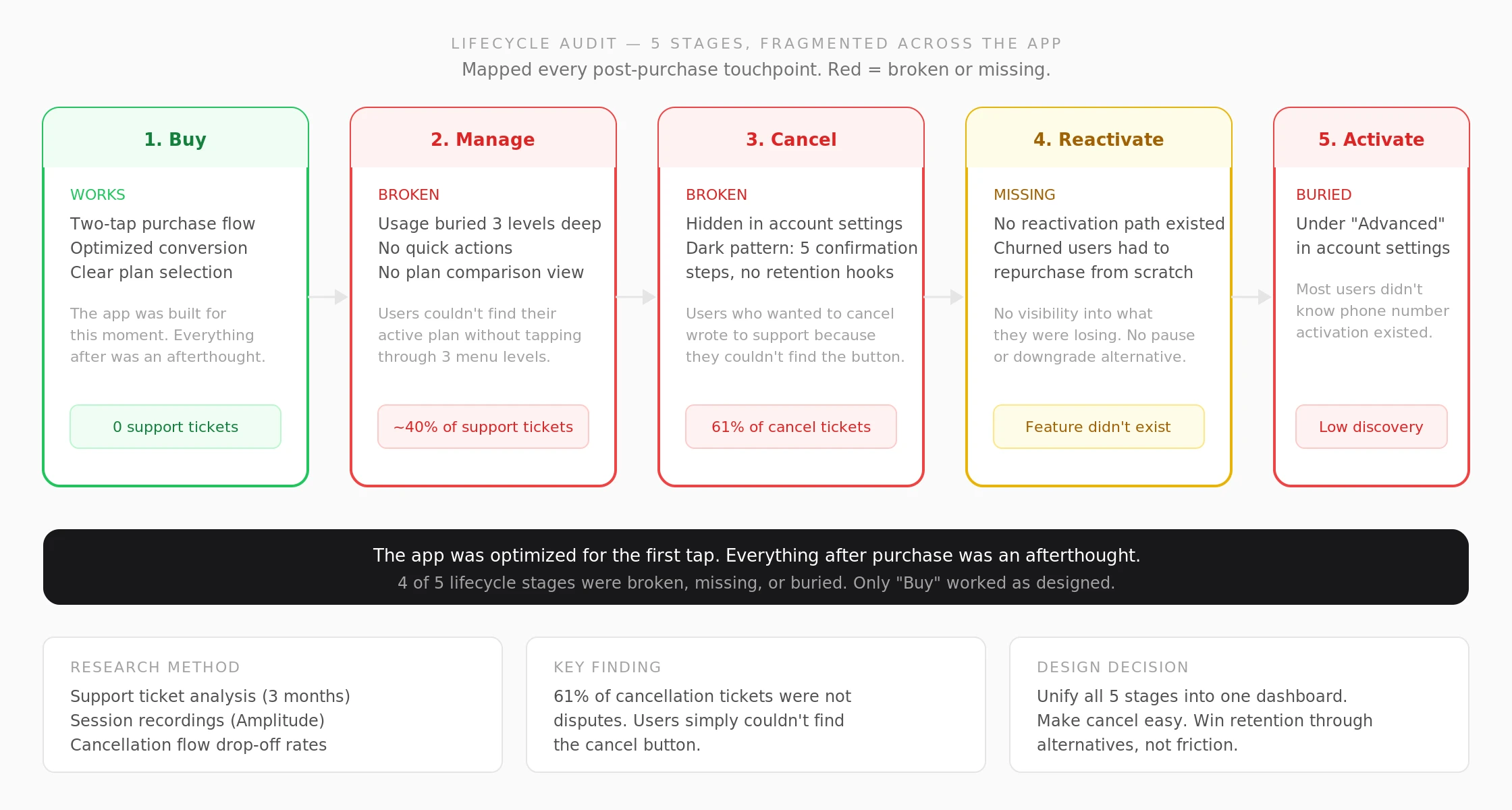
Lifecycle audit. 4 of 5 post-purchase stages were broken, missing, or buried. Support ticket analysis (3 months) + session recordings revealed most cancellation tickets were not disputes. Users simply could not find the button.
02 - The problem
Users who wanted to self-serve either gave up or wrote to support.
The app sold plans aggressively but abandoned them after purchase. Users had to navigate a fragmented app to find their subscription, manage it, or cancel. Phone activation was buried so deep most users didn't know it existed. The app was optimized for the first tap. Everything after purchase was an afterthought.
The session recordings told the full story. Users who wanted to cancel would tap Settings, then Account, then scroll past 8 items, then find a small "Cancel subscription" link. Many gave up and wrote to support instead. The cancellation flow had five confirmation steps designed as friction, not as retention. No pause option, no downgrade, no visibility into what they'd lose. The app was punishing users for trying to leave instead of giving them a reason to stay.
03 - What I did
Unifying five lifecycle stages into one coherent dashboard
1. Mapped five lifecycle stages (buy, manage, cancel, reactivate, activate) into one coherent dashboard with consistent entry points.
2. Built a cancellation path that surfaced retention options without blocking users who had already decided to churn.
3. Promoted phone activation from a buried setting under "Advanced" to an in-context dashboard action.
4. Designed the plan comparison and upgrade flow with side-by-side pricing deltas so users see exactly what changes before committing.
5. Documented every component with auto-layout variants for 12 plan states (active, paused, expired, pending cancellation, etc.) so engineering could build directly from the Figma file without a walkthrough.
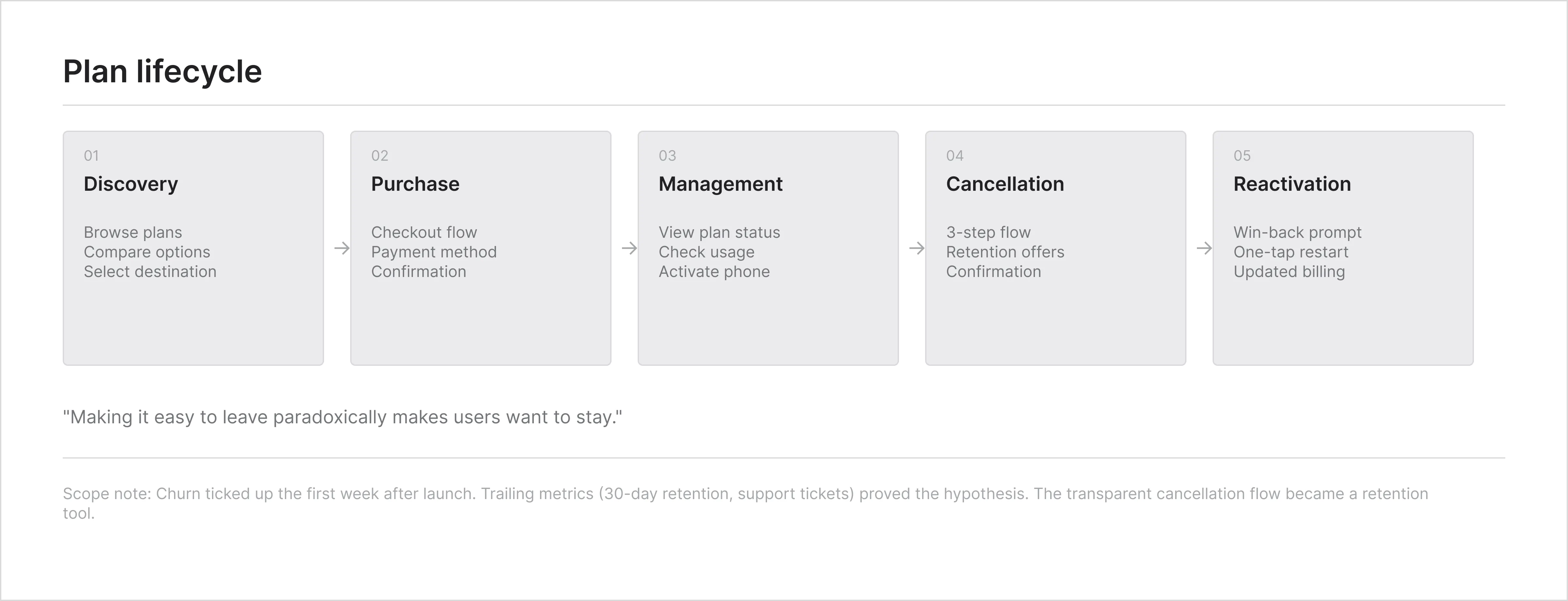
Journey map. Five lifecycle stages mapped with entry points, pain points, and drop-off rates from Amplitude session data.
04 - Process artifacts
From scattered screens to a single lifecycle view
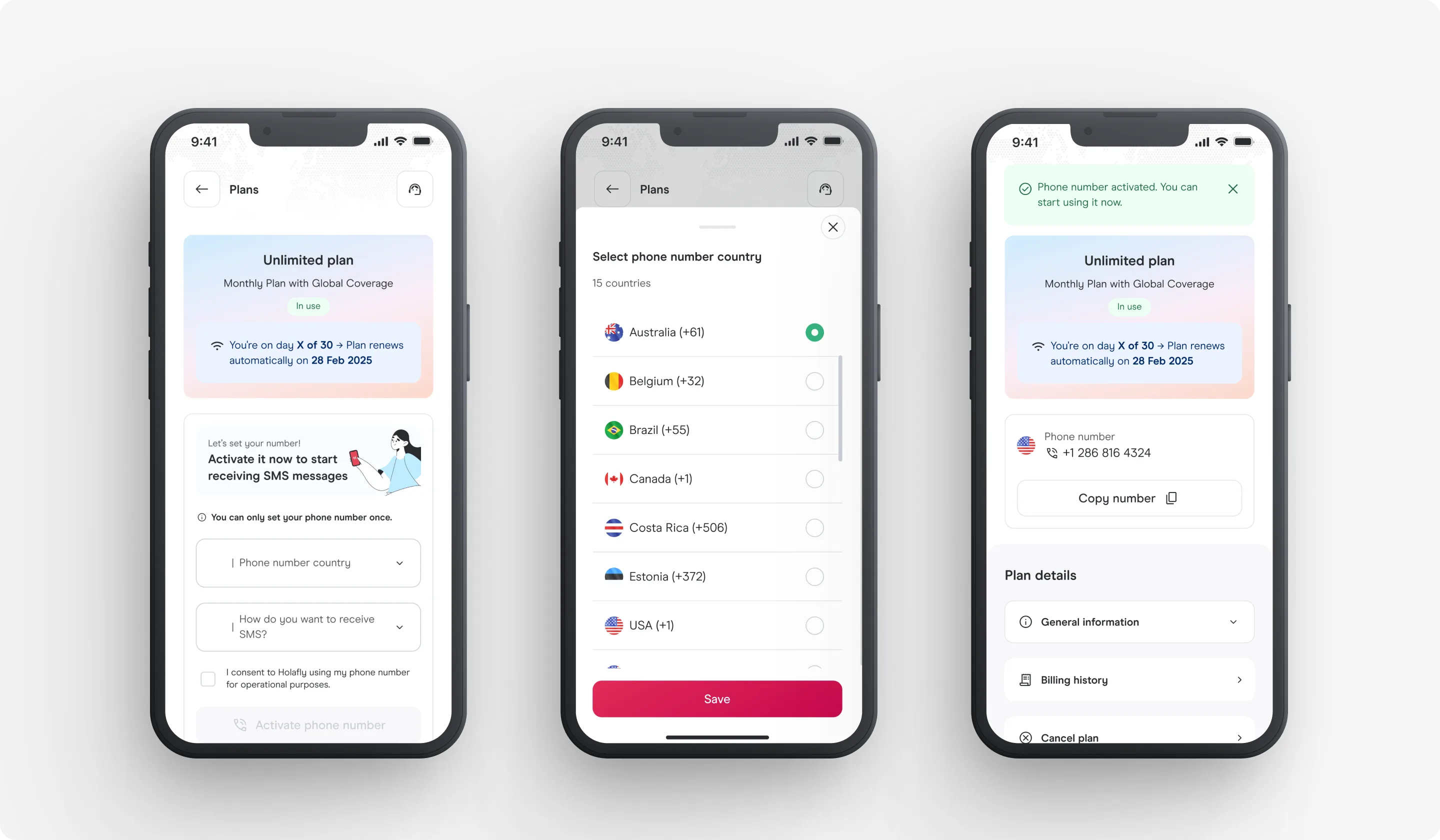
Plan dashboard. Usage, billing, and quick actions visible without drilling into sub-menus. Auto-layout components built for 12 plan states.
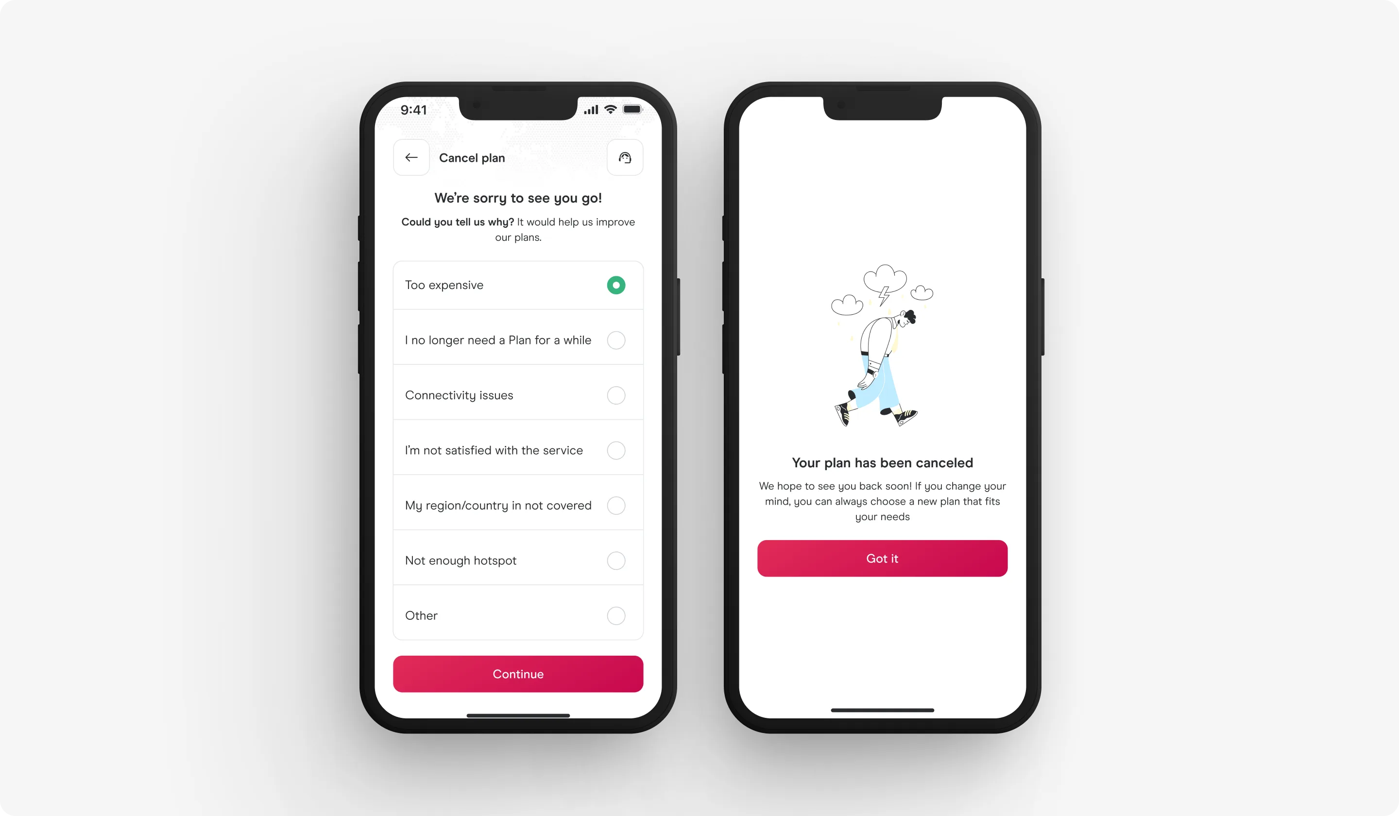
Cancellation flow. Three retention hooks (pause, downgrade, usage reminder). None block the exit. If a user wants to cancel, three taps. Edge cases: expired card during downgrade, mid-cycle cancellation, partial refund logic.
05 - The solution
From fragmented to unified lifecycle
All five lifecycle actions from one view. Usage, billing, and quick actions visible without drilling into sub-menus. The cancellation flow offered three intervention points: pause the plan, downgrade to a cheaper tier, or view remaining usage. None of these blocked the exit. If a user wanted to cancel, they could do it in three taps. The plan comparison showed current vs. new side by side with an explicit pricing delta.
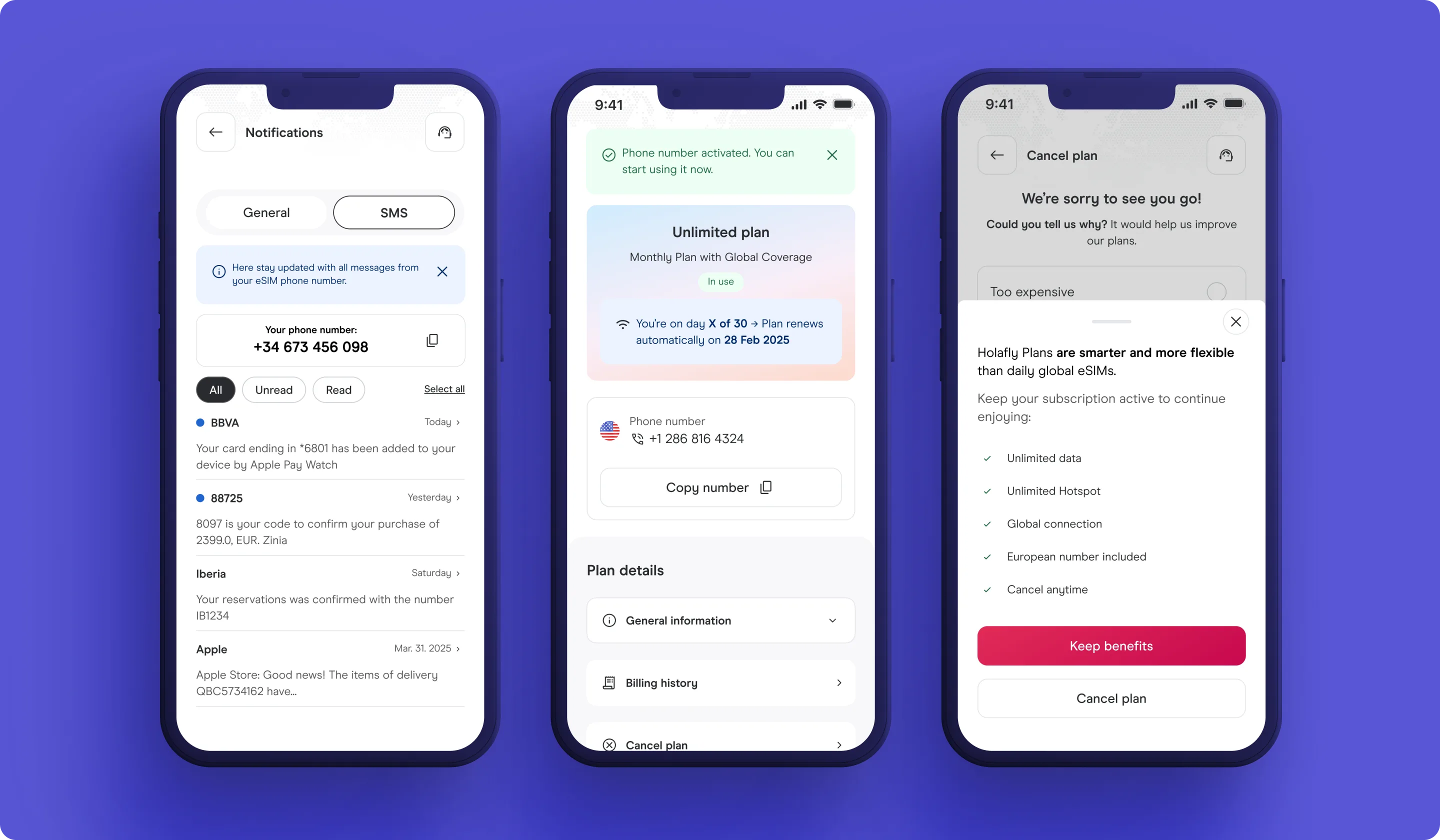
Unified lifecycle. Manage, cancel, upgrade, and reactivate from one view. Side-by-side pricing delta for plan comparison so users see exactly what changes.
06 - The result
Cancellation tickets dropped, activations tripled
Cancellation tickets dropped significantly. Phone activations tripled. Account settings stopped being a reason to contact support. Users who did churn reported higher satisfaction with the process itself. Reactivation rate for cancelled users actually increased because the flow made it clear what they were losing.
The Figma file became the source of truth. Engineering pulled component specs directly from the structured file. Zero back-and-forth on edge case behavior because every state was documented: loading, empty, error, partial data, expired, and mid-transition.
07 - What I learned
Retention is mostly a wayfinding problem
When users can finish their own admin task in the app, they rarely escalate and often renew. Making it easy to leave paradoxically makes users want to stay. Making cancellation easy didn't increase churn. It reduced the anxiety around staying.
The other takeaway: self-service cancellation isn't a churn risk. It's a trust signal. Users who could cancel easily reported higher satisfaction and reactivated at higher rates. Removing friction from the exit made the product feel safer, not disposable.
I presented this framing to the product and growth teams before building anything. The instinct from growth was to add friction to the cancel flow. I walked them through the support ticket data and the session recordings showing users rage-tapping through settings. The data shifted the conversation from "how do we prevent churn" to "how do we earn retention." That reframe set the scope for the entire project.
08 - Decisions not made
What I chose not to build
1. I didn't design dark patterns to prevent cancellation. "Are you sure?" modals, hidden cancel buttons, and mandatory retention calls were proposed. They reduce short-term churn numbers but destroy long-term trust and increase support volume.
2. I didn't combine upgrade and cancellation into one flow. Users upgrading are in a growth mindset. Users cancelling are in a loss mindset. Mixing them creates confusion and reduces conversion on both.
3. I didn't design an automated win-back campaign. Re-engagement emails and push notifications were a CRM initiative, not a product design problem. The cancellation flow captured the reason for leaving; CRM used that data for targeted outreach.