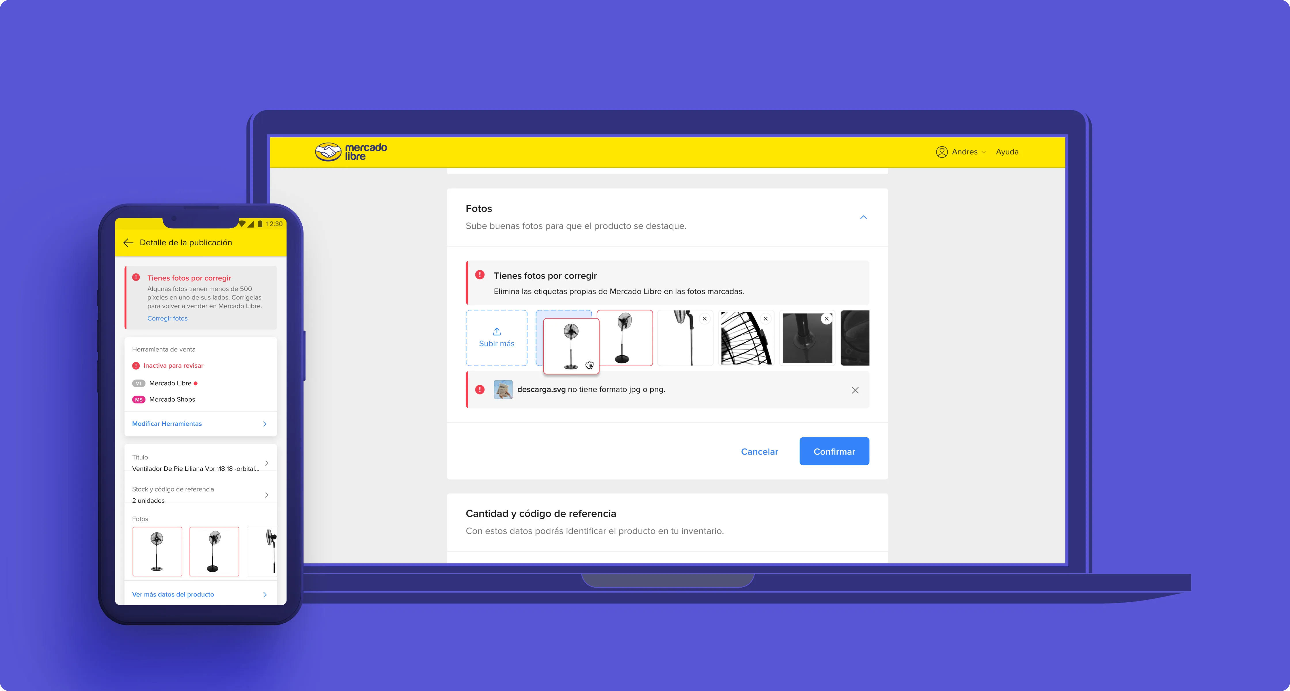
01 - The context
Generic notifications, zero clarity
Sellers on Mercado Libre received a single generic notification when listing photos broke policy. The message was legal text, not UX copy. Sellers had no idea which photo failed or why, and the support queue was drowning in clarification requests. This was the first of three consecutive projects tackling seller photo quality on the platform.
I started by shadowing the moderation operations team for a week. I watched moderators process queues, read the escalation threads sellers wrote, and mapped the gap between what the platform said and what the seller understood. The moderation rules were correct. The communication was broken. A seller in rural Mexico running a small business from their phone received the same legal-language notification as a power seller in Buenos Aires with a desktop setup and an assistant. The system treated them the same way, but their context, vocabulary, and tech literacy were completely different.
02 - The problem
A confused seller generates confused buyers.
A seller with 5 photos would get "Your listing has been moderated. See policy X." They would retry with the same mistake. Moderation queues piled up. Sellers escalated to support out of confusion, not dispute.
I analyzed 2,000 support tickets tagged as "moderation clarification" and found that nearly four out of five asked one of two questions: "which photo?" or "what's wrong with it?" The existing notification answered neither. The research also revealed a second problem: sellers who did understand the rule often didn't know how to fix the photo. They had the intent but not the tooling. That insight split the project into two tracks: better communication (this case) and an integrated editor (Photo Studio, a separate case).
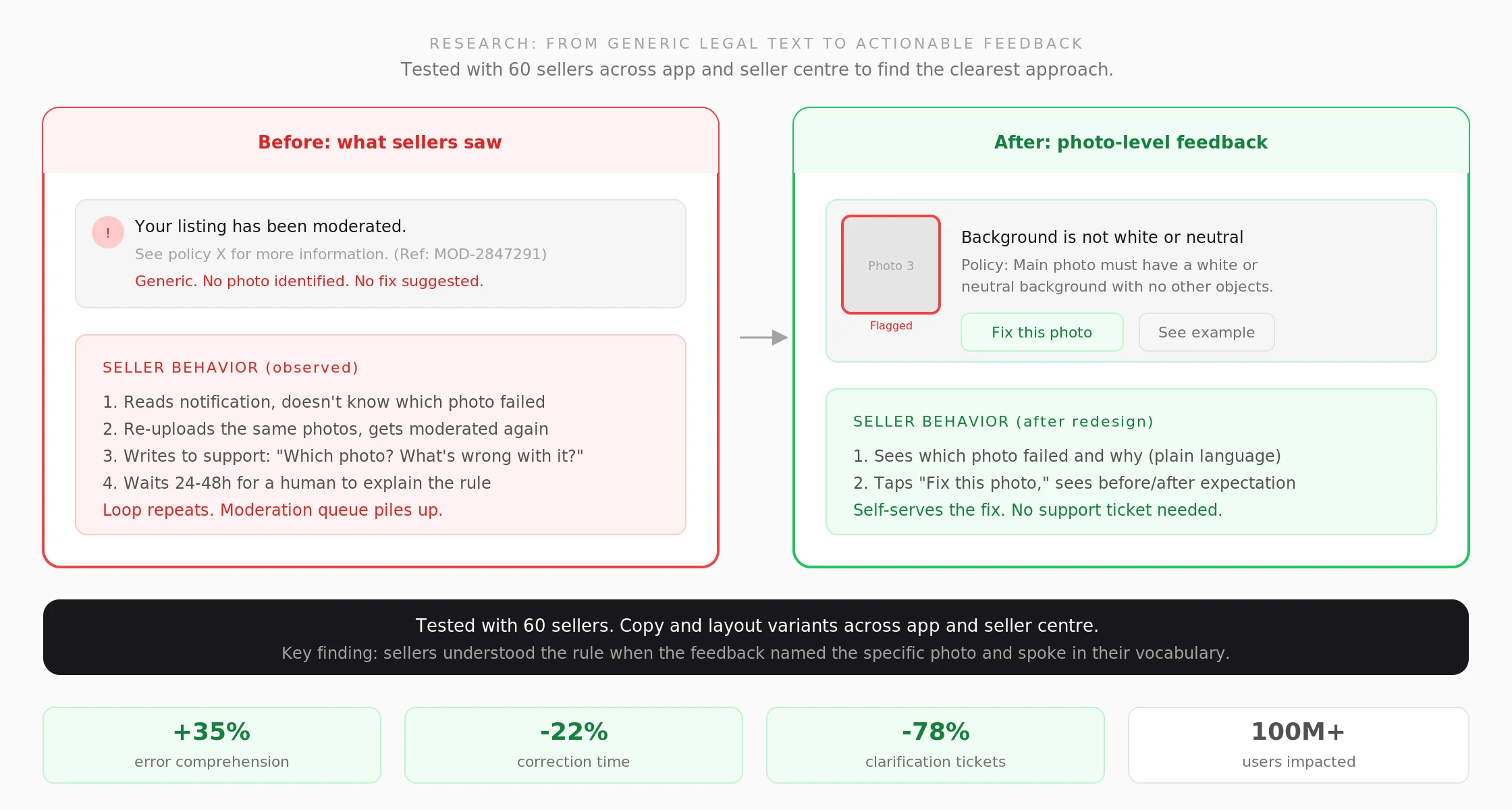
Before and after. Tested with 60 sellers across app and seller centre. The key finding: sellers understood the rule when feedback named the specific photo and spoke in their vocabulary, not legal terms.
03 - What I did
From legal text to actionable, photo-level feedback
1. Replaced the generic alert with a photo-level card that names the exact rule broken and points at the offending image.
2. Wrote the guidance in the seller's own vocabulary so the fix reads as a checklist, not legal terms.
3. Tested copy and layout variants across the app and seller centre with 60 sellers to find the clearest approach.
4. Designed the moderation queue improvements: auto-approval pipeline that reduced manual review volume.
5. Built the component library in Figma with auto-layout for 8 moderation states (pending review, single violation, multiple violations, appeal submitted, auto-approved, manually approved, rejected, and re-submitted). Structured file allowed engineering to pull specs without a handoff meeting.
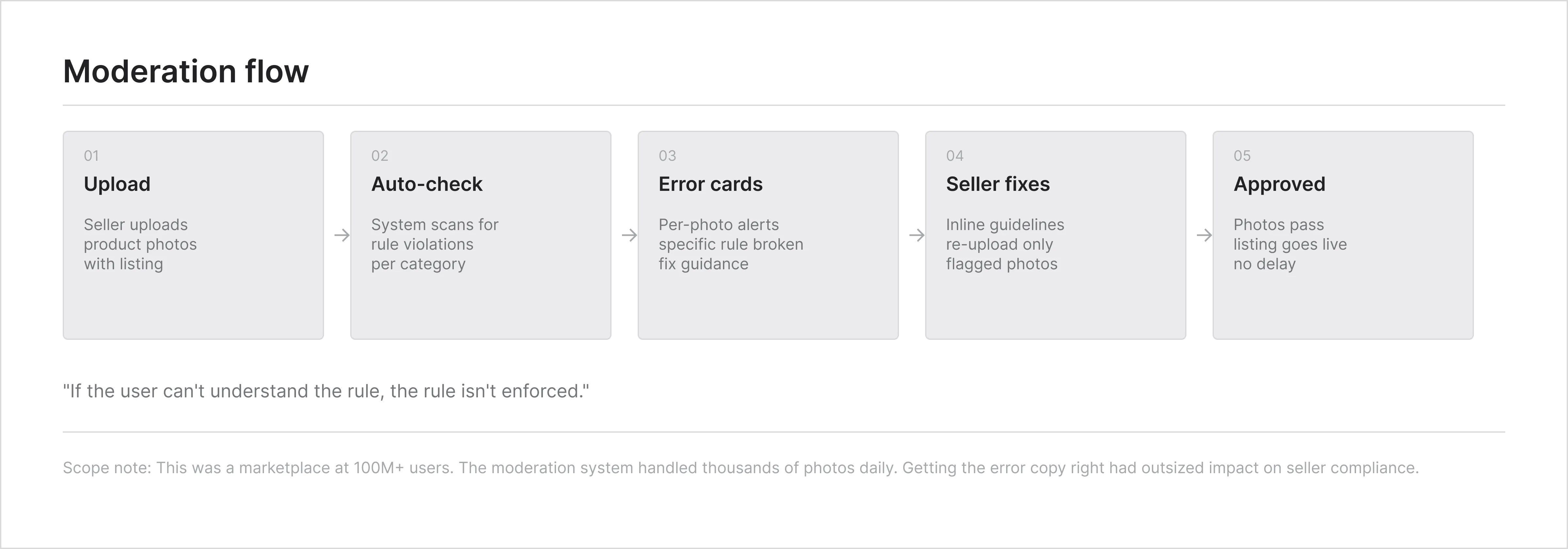
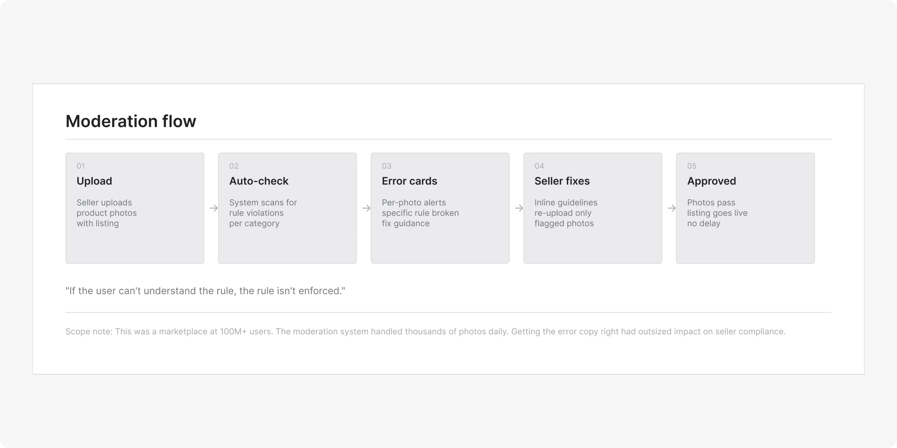
Moderation flow. From block notification to fix. Each path designed for sellers with varying tech literacy, tested across mobile and desktop seller centre.
04 - Process artifacts
From upload guidelines to error-specific feedback
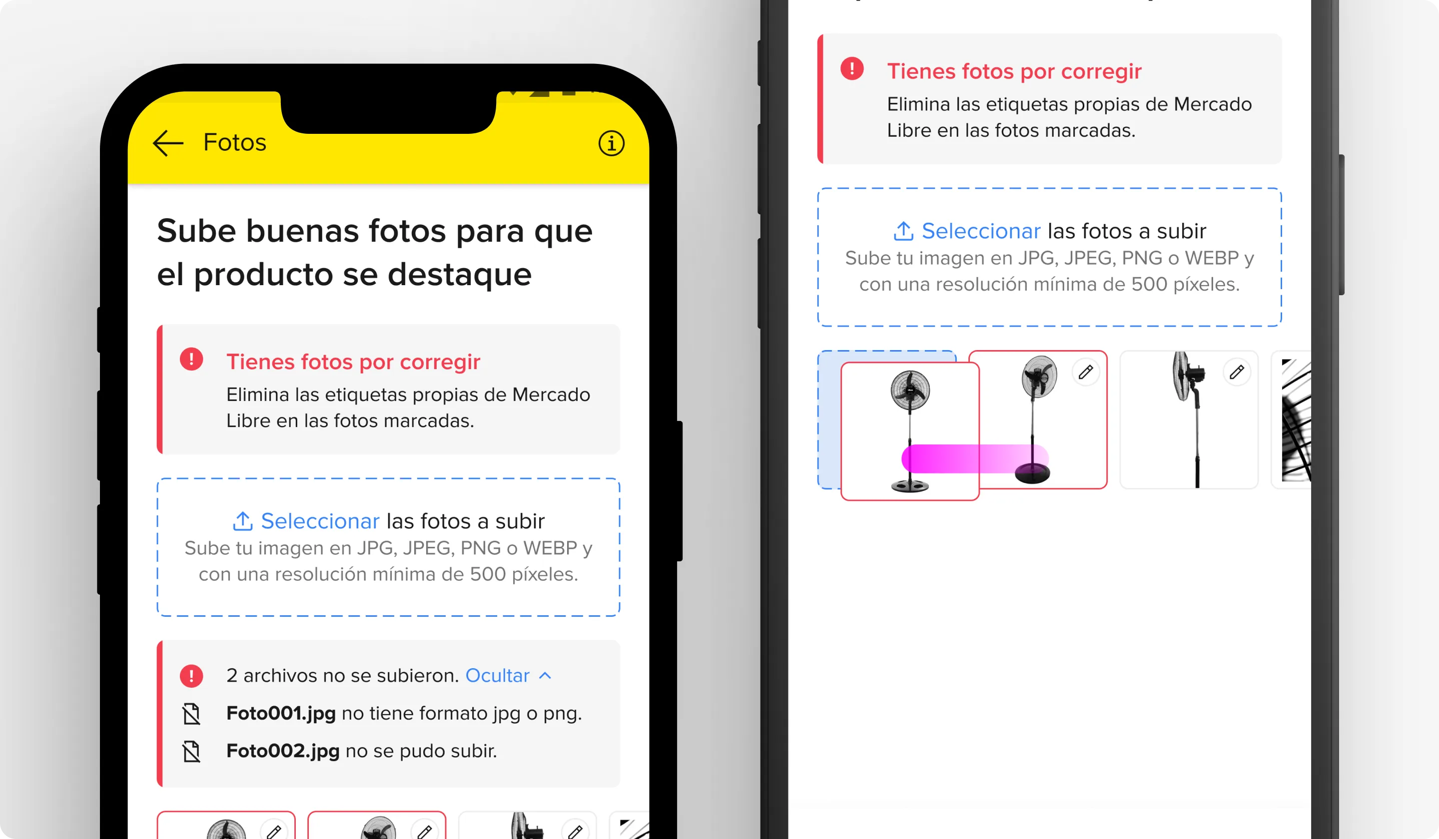
Inline upload guidelines. Prevention at the source. Guidelines surface during photo upload, not after rejection. Reduced violations before they reached the moderation queue.
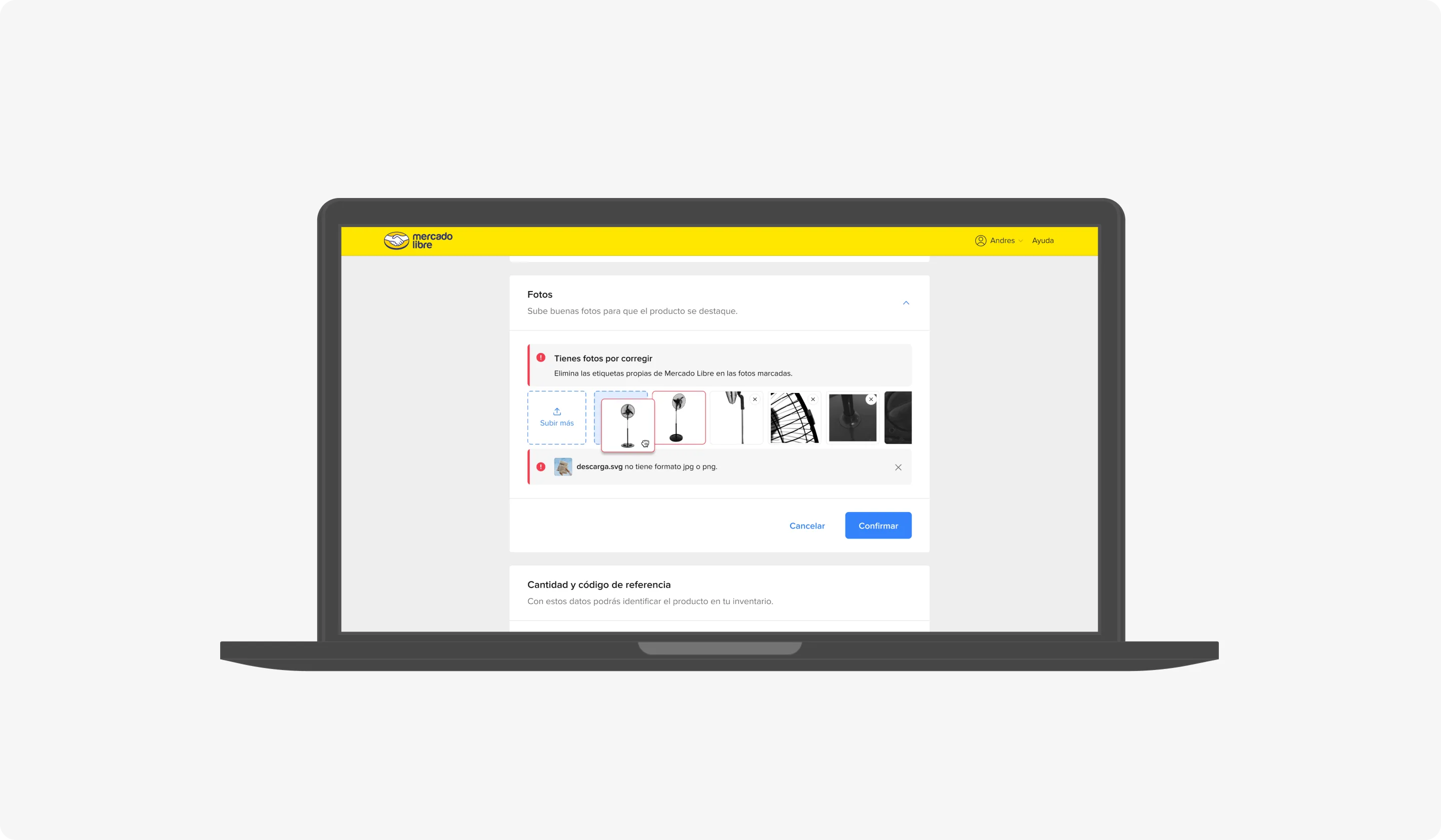
Auto-check with error spec. Every error state documented: single violation, multiple violations, overlapping rules, appeal in progress, and auto-approved after correction.
05 - The solution
Make compliance actionable, not just informational
The redesigned experience replaced the generic moderation message with a photo-level card. Each card showed the affected photo with a colored border, the exact policy rule it violated, and a plain-language fix. Sellers could tap any flagged photo to see the before/after expectation. The system also added inline guidelines during the upload flow itself, reducing violations at the source.
Design decision. In-listing overlay vs. dedicated review screen. Overlay won: sellers stayed in context, correction rate was 2x higher in testing.
06 - The result
Sellers fix photos instead of arguing the rule
Rollback rates dropped 70% in three months. Seller understanding of moderation errors rose 35% and average correction time dropped 22%. Support volume for "clarification" dropped 78% while appeal rate stayed flat. The pattern was adopted as the platform standard.
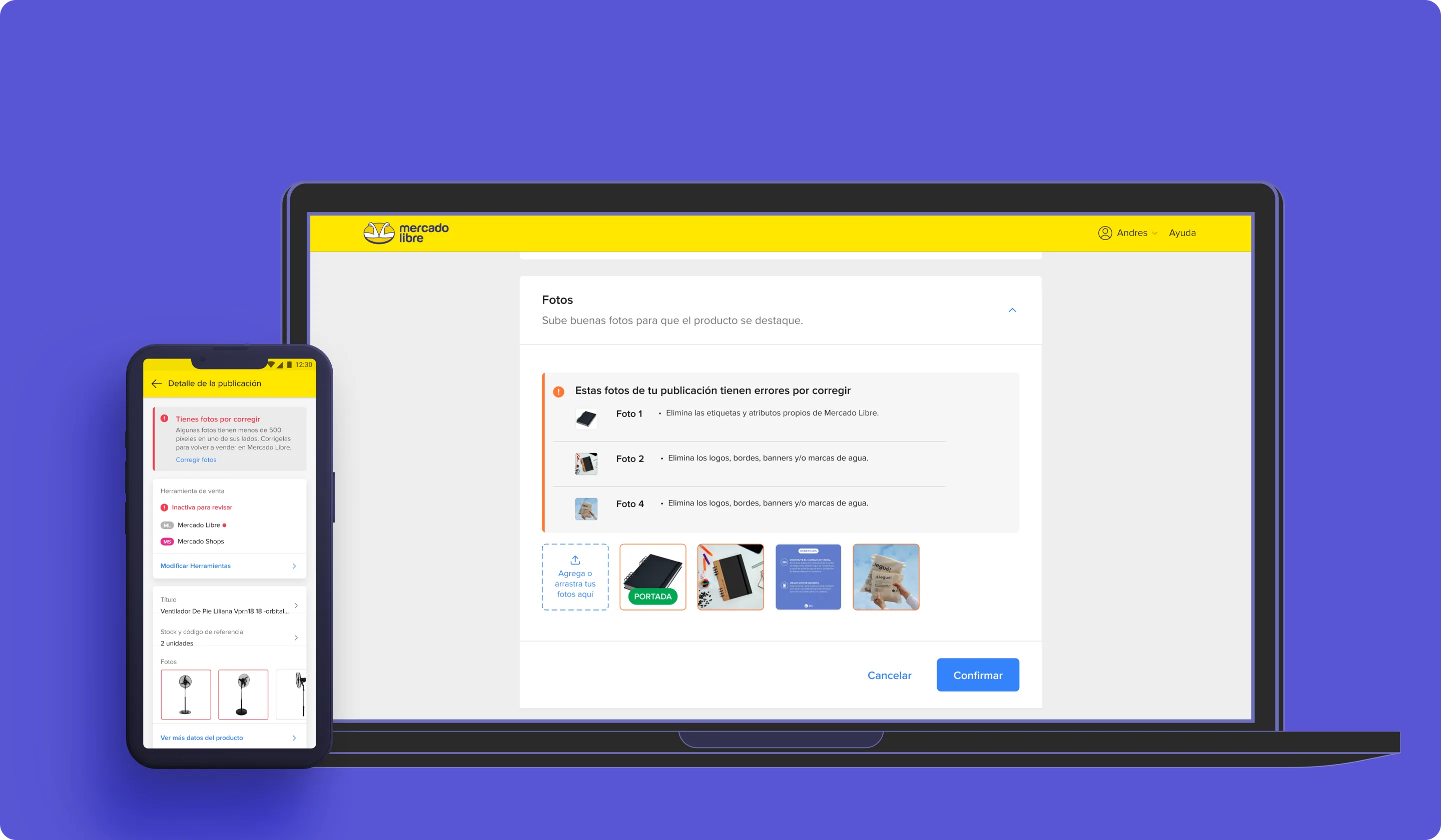
Shipped UI. Photo-level moderation cards with plain-language fix instructions across Mercado Libre.
07 - What I learned
Moderation messaging is a product surface, not legal text
When the seller can see which photo failed and what to change, compliance becomes a task instead of a dispute. People respect rules they understand.
Designing for a two-sided marketplace means every seller-facing decision has a buyer-facing consequence. A confused seller produces a bad listing. A bad listing loses a sale. The moderation redesign wasn't a seller UX project. It was a marketplace quality project that started at the seller's screen.
08 - Decisions not made
What I chose not to build
1. I didn't design a full photo editor inside the moderation flow. The scope was communication, not correction. Photo correction came later as a separate product (Photo Studio).
2. I didn't design auto-correction without human review. The platform's moderation accuracy wasn't 100%. Auto-rejecting without human review would have destroyed seller trust.
3. I didn't redesign the appeal flow. Appeals were a separate workflow with different stakeholders.