Checkout Unification
Three legacy checkout experiences unified into one design system, with anti-fraud compliance fields and AI-assisted validation.
Role
Led the full redesign: concept
Platform
Mobile + Web
Constraints
5 constraints
Goal
Collapse three parallel checkouts into a single maintained design system that could accommodate new compliance requirements and scale without duplicated maintenance
Problem
iOS 26's new keyboard raised higher than previous versions, obscuring the app checkout's bottom sheet order summary. Simultaneously, new anti-fraud regulations required additional fields, double email validation and billing address, that the existing layouts couldn't accommodate.
Key Insights
The order summary needed to be visible at all times, not behind a sheet or an extra tap, to comply with the keyboard constraint and to meet user expectations for payment transparency.
The 23 divergence points fell into two categories: 'must unify' (different required fields, inconsistent validation logic) and 'will unify' (spacing, button label inconsistencies).
The new compliance fields, introduced with clear microcopy explaining their purpose, were less likely to cause abandonment if users understood why they were being asked.
Process
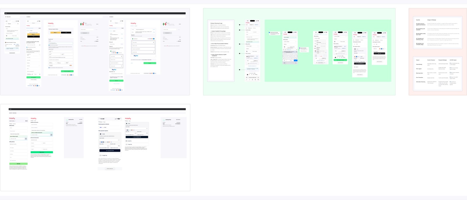
Wireframes
Designed a unified checkout as one layout that adapts across three breakpoints , not three separate designs that share a name. The order summary moved in-screen. Compliance fields added with progressive disclosure for billing address (defaults to collapsed).
User Flows
Ran Gemini heuristic evaluation of the new layout against Nielsen's 10 principles, specifically flagging visibility of system status (order total always visible), error prevention (inline validation), and flexibility for returning users (pre-filled fields where possible).
Iterations
Behavioral simulation against three Holafly user personas, first-time buyer, returning buyer, fraud-flagged card user, surfaced two issues before handoff: the billing address section felt disconnected from payment, and the double email field lacked enough contextual explanation. Both iterated before final handoff.
Process / Wireframes
Solution
One checkout design across web, mobile web, and app, with platform-appropriate breakpoints. Order summary integrated into the main screen (not a sheet). Double email validation and billing address fields with inline validation and contextual microcopy. Progressive disclosure for billing address.
Final UI / Solution
Order summary always visible, in right panel on desktop, collapsible header on mobile
Double email validation with inline error on blur, not on submit
Billing address defaults to collapsed ('Same as delivery'), expands on mismatch or user choice
Single design system across all three previous checkout surfaces
Outcomes
single design system
Checkout Surfaces Unified
must-unify + will-unify
Divergence Points Resolved
adopted team-wide
Validation Method
The checkout is now a single maintained design across all platforms, eliminating the design debt of three parallel systems.
Learnings
What worked
Doing a thorough audit and classifying divergence points before designing anything, it made alignment with Product and Engineering faster and more specific.
AI-assisted behavioral simulation proved genuinely useful as a substitute for formal testing: it surfaced two real issues (billing address disconnect, email field context) that would have shown up in usability testing.
What I'd improve
Formal A/B testing comparing the unified checkout against the previous experiences, the design shipped as part of a larger platform update, so no comparative data is available
Earlier Engineering involvement in the compliance field positioning, the billing-address-to-payment-section distance was raised late in the review cycle