Seller Photo Moderation
Turning a generic moderation notification into a contextual, photo-level guidance system, error comprehension +35%, correction time -22%.
Role
Led UX design of the redesigned moderation experience
Platform
Mobile + Web
Constraints
4 constraints
Goal
Tell a seller that a specific photo is wrong, in a way they understand what's wrong and know exactly how to fix it, reducing support contact volume and resubmission cycles
Problem
Sellers responded in one of two ways: they contacted customer support (creating volume), or they guessed and resubmitted (creating moderation queue re-entries). Neither outcome served the platform, the seller, or the buyer.
Key Insights
Sellers failed to fix their photos because the notification gave them nothing to act on, not because they were unwilling or technically incapable.
Concept testing revealed a clear preference pattern: the in-listing overlay (Option B) put the information exactly where the seller was already looking, at their photos, and the contextual marker ('this specific photo has this specific problem') aligned with how sellers thought about their listings.
Options A and C (notification-level redesign and dedicated review screen) both required an additional navigation step, sellers had to leave what they were doing to see the problem.
Process
Wireframes
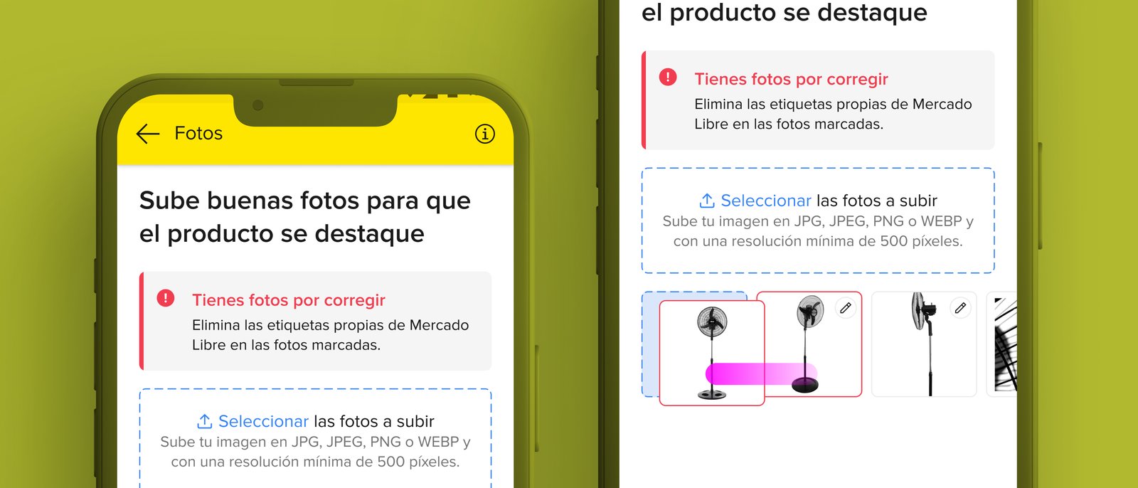
Designed a visual marker system: color-coded border state (severity/type), icon (policy category), and tooltip (plain-language violation explanation + direct action: 'Fix this photo' → opens photo upload flow). The system needed to work across 4 policy types with enough visual differentiation to be scannable.
User Flows
Primary flow: seller opens listing → sees colored border on thumbnail → taps marker → reads explanation in plain language → taps 'Fix this photo' → photo upload flow. Secondary flow: seller ignores marker → re-enters listing → sees persistent marker until violation is resolved.
Iterations
Three design directions tested in concept test with sellers: notification redesign, in-listing overlay, dedicated review screen. Overlay won on all criteria: information was contextual, actionable, and at the point of attention. Iterated on the visual marker system to achieve scannability without requiring a legend.
Process / Wireframes
Solution
In-listing overlay with color-coded borders and policy-category icons on affected photo thumbnails. Tapping reveals a plain-language explanation of the violation and a direct action that opens the photo upload flow. Markers persist until the violation is resolved.
Final UI / Solution
Color-coded border state + icon visible directly on thumbnail, no navigation required to see the problem
Plain-language tooltip with violation explanation and 'Fix this photo' CTA
Extensible
new policy types integrate without redesigning the interaction
Persistent markers until violation is resolved, prevents re-entry into the moderation queue
Outcomes
sellers understanding what to fix
Error Comprehension
average time to fix a violation
Correction Time
users across LATAM
Scale
Error comprehension improved 35% and average correction time reduced 22% across millions of active listings.
Learnings
What worked
The three-direction concept test was worth the extra design time, it produced a definitive answer that aligned stakeholders and research, rather than a judgment call.
Starting from the usability testing finding ('they corrected it without issue when told what was wrong') made the solution obvious: put the information where the seller is already looking.
What I'd improve
Proactive guidance before submission, a photo quality check in the listing creation flow that catches common violations before they reach moderation
Aggregated seller view showing all listing violations across their catalog, not just per-listing, large sellers with many affected listings needed a higher-level triage view