Freemium Landing
A landing page designed to convert free-tier users into paying subscribers, across 7 global destination regions.
Role
UX and UI design of the landing page
Platform
Mobile + Web
Constraints
4 constraints
Goal
Design a landing page that converts freemium users into paying subscribers without undermining the trust the free trial is designed to build
Problem
The landing page had to do two things simultaneously: deliver the trial experience clearly (what you get, how to get it, how to activate), and plant conversion intent (what Holafly plans look like when the trial ends, and why they're worth paying for). A page that prioritizes conversion too aggressively loses trust. One that focuses only on the trial misses the commercial opportunity.
Key Insights
Leading with the destination selector as the primary hero element, not the offer details, made the product feel relevant before the user read a single line of copy.
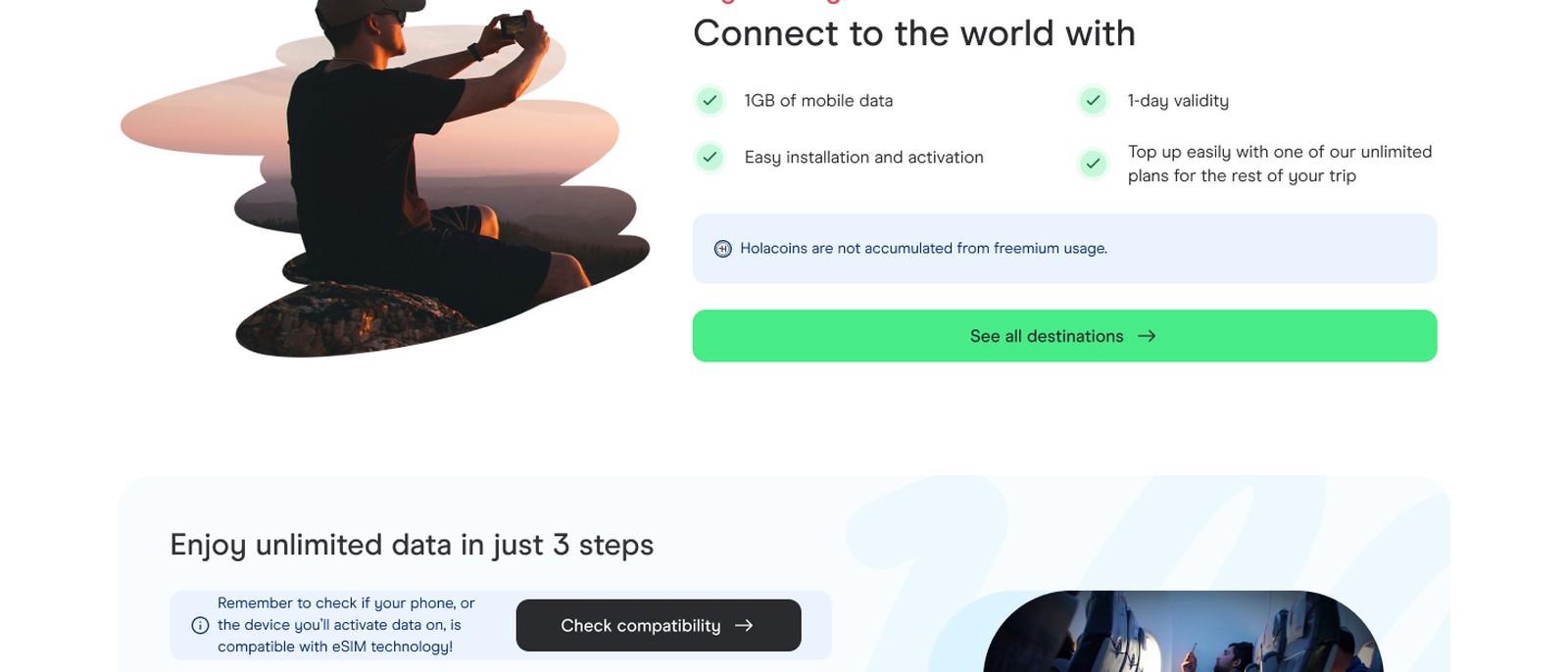
The trial offer details (1GB · 3-day · easy activation) performed better as supporting context below the destination selector than as the headline, the headline was about connectivity and freedom, not mechanical trial specs.
Plans appearing at the end of the destination grid, framed as 'what's available beyond your trial,' felt natural rather than pushy, users didn't flag it as aggressive conversion.
Process
Wireframes
Designed the page hierarchy around the user's mental model: destination first, trial context second, 'how it works' third, plans in context at end. Built within Volare DS, no net-new components needed for the primary layout.
User Flows
Primary path: user lands → selects destination zone → sees trial availability → reads how it works → sees what plans are available → either activates trial or goes directly to plan selection. CTA goes directly to checkout.
Iterations
FAQ content was written directly from CX contact logs, the 8 questions chosen were the actual queries that drove the most support volume, not a generic FAQ format. This made the section functionally useful, not just reassuring.
Process / Wireframes
Solution
Destination selector as the primary hero visual across 7 zones. Trial details (1GB · 3-day · easy activation) as supporting context. 3-step 'how it works' covering compatibility, plan selection, and activation. Holafly Plans appearing contextually after the destination grid. FAQ from CX log data.
Final UI / Solution
Destination selector across 7 zones as the primary hero, user's frame of reference, not the offer
Trial specs as supporting context, not headline, benefit-first framing
3-step flow with compatibility checker link at the first step
Plans in context at end of destination section, not a separate upsell section
Outcomes
7
Coverage
8
FAQ Source
+18%
Conversion Lift
The landing page serves as the primary entry point for users acquired through the free trial, bridging the gap between trial activation and plan purchase intent.
Learnings
What worked
Using CX contact log data to write the FAQ, it produced content that was genuinely useful rather than reassuring-sounding but functionally empty.
The destination-first hierarchy was the right call: it made the product relevant before the user committed to reading any copy, and it naturally led into plan selection.
What I'd improve
A/B testing destination-first vs. offer-first hero to validate the hypothesis with real traffic data
Personalized plan recommendations based on destination selection, if a user selects Europe, surface the most relevant plan for European coverage immediately