Service journeyMixed-method researchContent designUsability validation
S / SITUATION
The platform knew the problem. The seller did not.
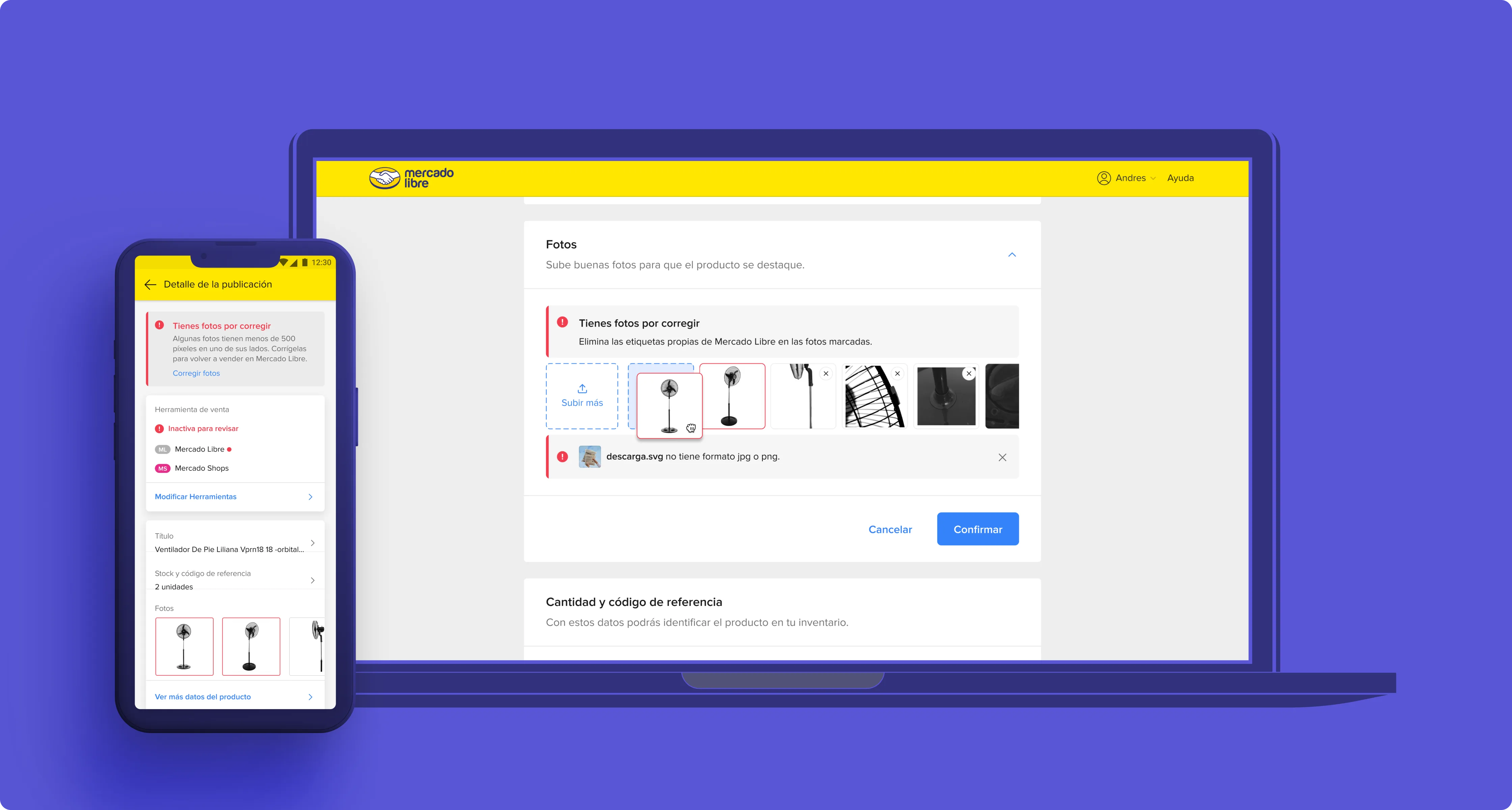
A generic policy notification could tell sellers their listing had failed, without identifying the photo or explaining the fix. Repeated attempts and clarification requests increased operational friction, while the listing remained unresolved.
I examined the service beyond the alert: moderation queues, support escalations and the seller’s attempt to continue publishing. The policy logic was only one part of the experience; people needed enough information to take the next action.
T / TASK & OWNERSHIP
Turn policy feedback into an actionable task.
I owned the feedback structure, photo-level interaction and content approach, working with Product, Engineering, Content and moderation operations. The aim was to improve comprehension and correction while reducing avoidable clarification support. Photo editing remained a separate product scope.
A / ACTIONS & DESIGN DECISIONS
Bring the explanation to the point of correction.
The feedback model
01
Which photo?
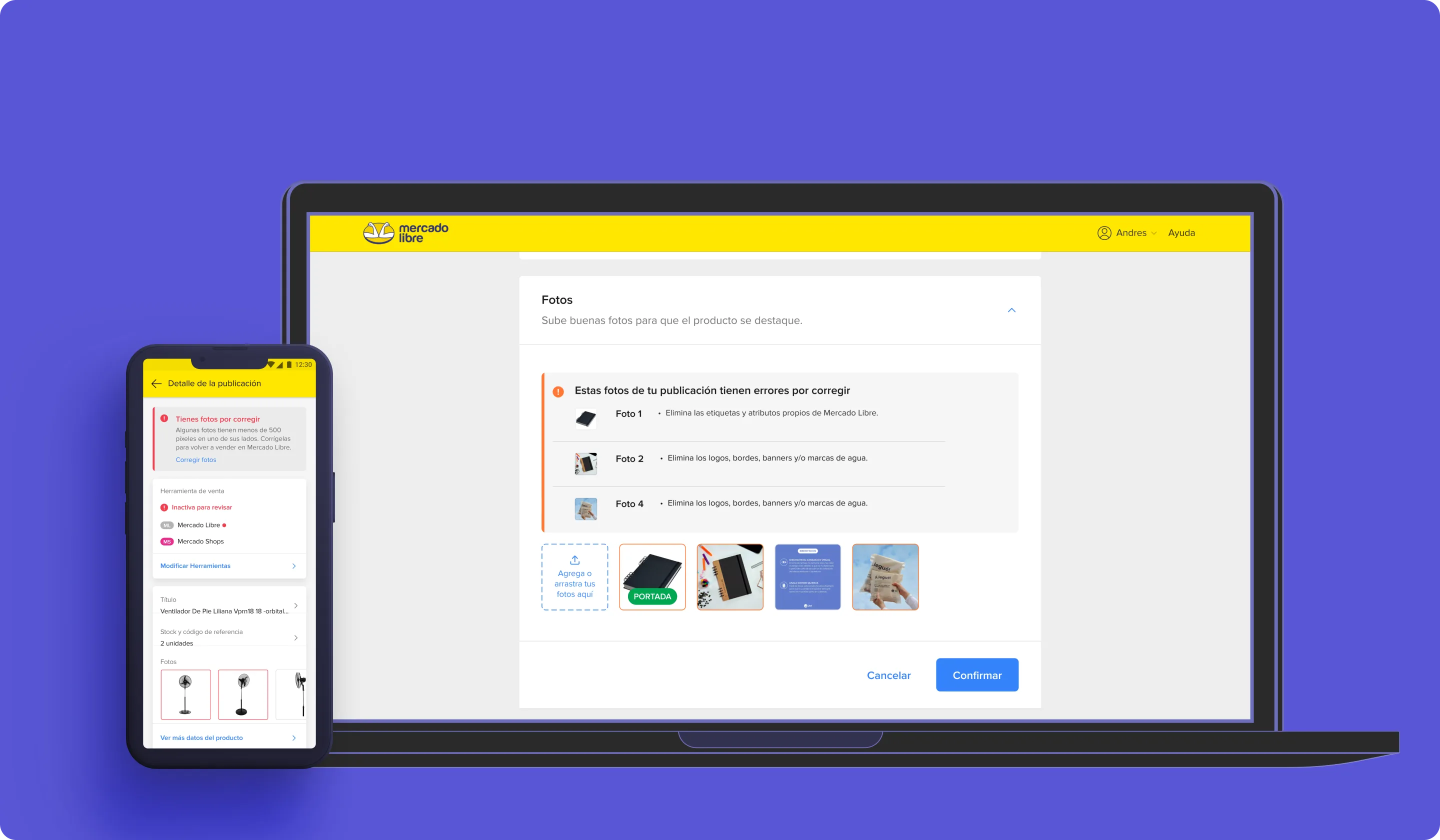
Show the affected image.
02
What happened?
Name the specific rule in clear language.
03
What next?
Give a correction the seller can act on.
01
Research synthesis
Answer the questions support was already hearing.
I analyzed 2,000 clarification tickets and found two recurring questions: which photo failed, and what was wrong with it? That evidence shaped the information architecture of the feedback, with the affected image first, followed by the specific issue and an actionable instruction.
02
Interaction & content
Keep the seller in the listing context.
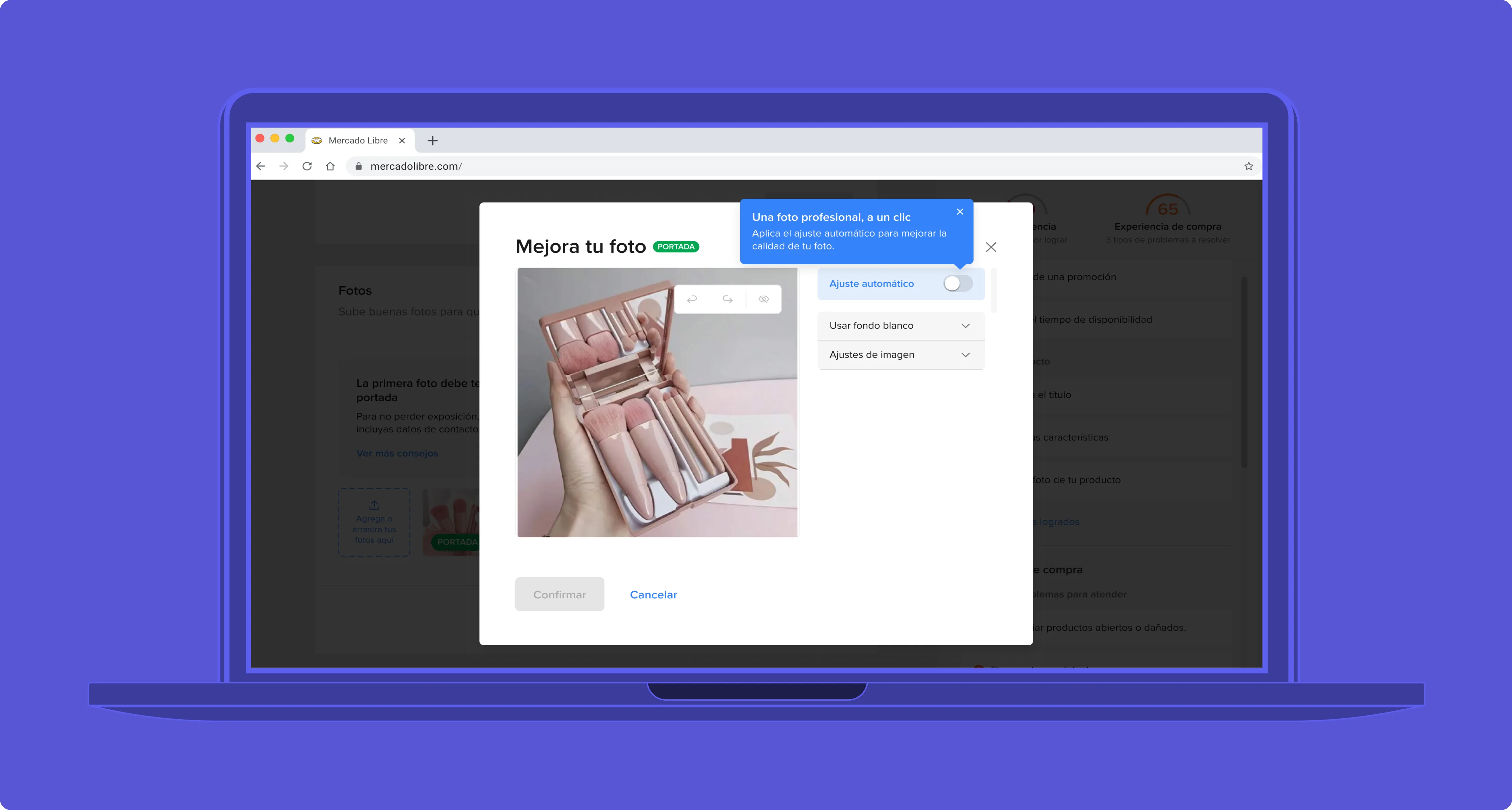
I explored a dedicated review screen and an in-listing overlay. The in-context approach performed better in testing, so the seller could identify and correct the issue without rebuilding their understanding of the task. Plain-language guidance replaced policy-heavy explanations.
03
Validation & service design
Connect prevention, feedback and operations.
I tested copy and layout variants with 60 sellers, added guidance during upload and documented the moderation states for implementation. The decision was to improve the communication and correction journey first; building a full image editor inside the alert would have blurred the problem and expanded delivery risk.
Photo-level moderation feedback and actionable guidance in the seller workflow.
R / RESULTS & BUSINESS IMPACT
More understanding. Less avoidable support.
+35%
error comprehension
−22%
average time to correct
−78%
clarification support volume
Error comprehension improved 35%, average correction time decreased 22% and clarification support volume fell 78%. The result connected user experience with operational impact: sellers could move forward with less uncertainty, while support handled fewer explanatory requests.
Outcomes of the moderation redesign. AI Photo Studio is a separate case with separate scope and metrics.
What I learned
In a marketplace, seller understanding affects listing quality and the buyer experience. Clear feedback is part of the service, with consequences for operations and business performance.
What I would explore next
I would continue testing feedback by policy category and seller context, and follow the journey from the first warning through successful correction.